Python & relevant
- Pandas: A Python library for slicing and dicing your data
- Data Frames
- Series
- Interoperates with numpy
- Matplotlib
- Seaborn
- scikit_learn: Python library for machine learning models
- Jupyter notebooks
Amazon Athena
- Interactive query service for S3 (SQL)
- Serverless
- Supports data formats
- CSV (human readable)
- JSON (human readable)
- ORC (columnar, splittable)
- Parquet (columnar, splittable)
- Avro (splittable)
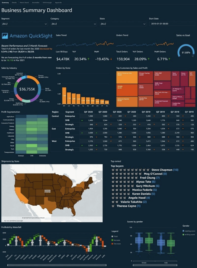
Amazon QuickSight
- Business analytics and visualizations in the cloud
- Serverless
- data source
- Redshift
- Aurora / RDS
- Athena
- EC2-hosted databases
- Files (S3 or on-premises)
- Excel
- CSV, TSV
- Common or extended log format
- AWS IoT Analytics
- Data preparation allows limited ETL
- SPICE
- Data sets are imported into SPICE
- Each user gets 10GB of SPICE
- Scales to hundreds of thousands of users
- Use cases
- Interactive ad-hoc exploration / visualization of data
- Dashboards and KPI’s
- Analyze / visualize data from:
- Logs in S3
- On-premise databases
- AWS (RDS, Redshift, Athena, S3)
- SaaS applications, such as Salesforce
- Any JDBC/ODBC data source
- Quicksight Q
- Machine learning-powered
- Answers business questions with Natural Language Processing
- Must set up topics associated with datasets
- Quicksight Security
- Multi-factor authentication on your account
- VPC connectivity
- Row-level security
- Column-level security too (CLS) –Enterprise edition only
- Private VPC access
- Elastic Network Interface, AWS Direct Connect
- QuickSight Visual Types
- AutoGraph
- Bar Charts: comparison and distribution (histograms)
- A histogram is a type of chart that displays the distribution of numerical data by dividing it into intervals or bins. Each bar represents the frequency or count of data points falling within each interval, providing insights into the data’s distribution and density.
- Line graphs: changes over time
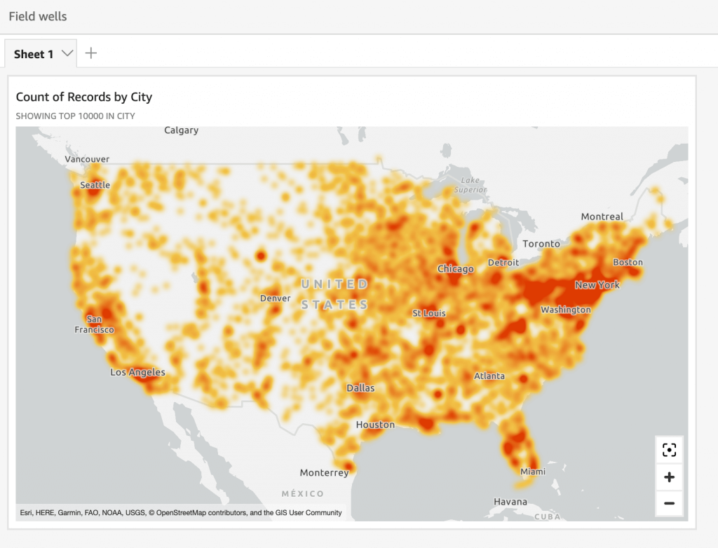
- Scatter plot, heat maps: correlation
- A heatmap is a visualization method that uses color gradients to represent values within a matrix. It displays data in a two-dimensional format where color intensity indicates the magnitude of values
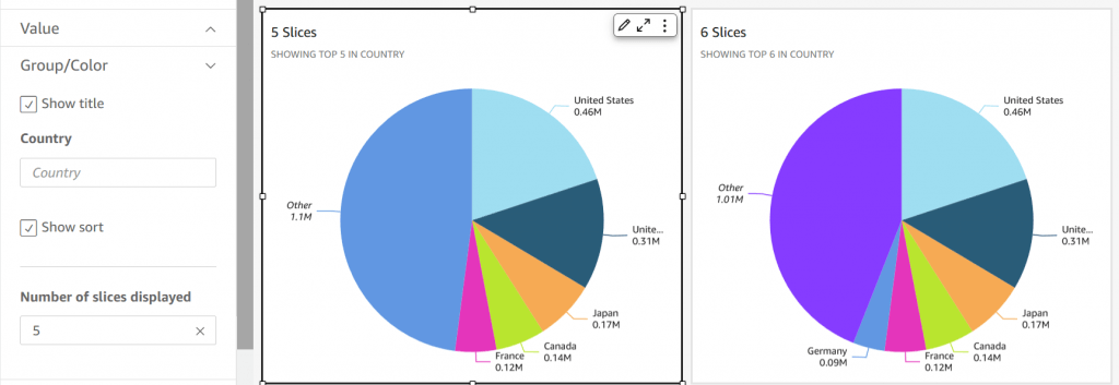
- Pie graphs: aggregation
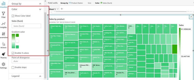
- Tree maps: Heirarchical Aggregation
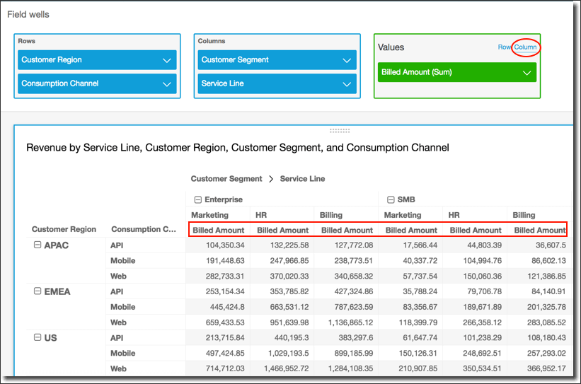
- Pivot tables: tabular data
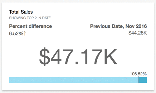
- KPIs: compare key value to its target value
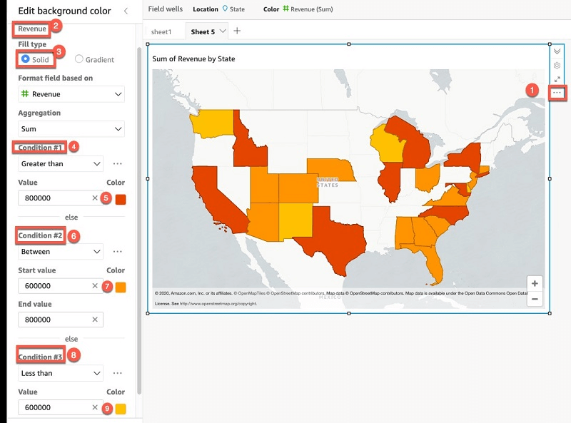
- Geospatial Charts (maps)
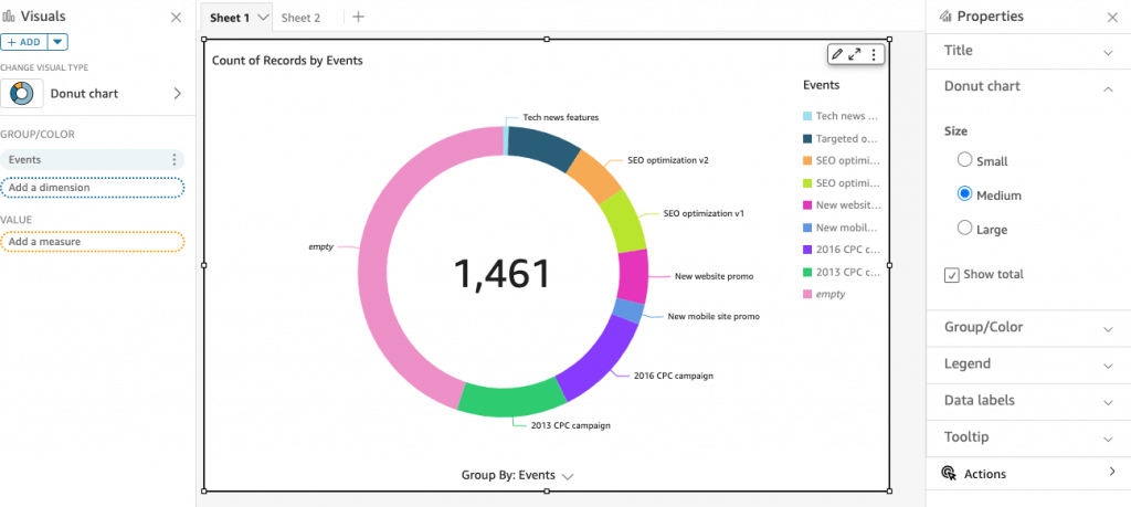
- Donut Charts: Percentage of Total Amount
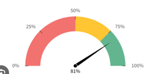
- Gauge Charts: Compare values in a measure
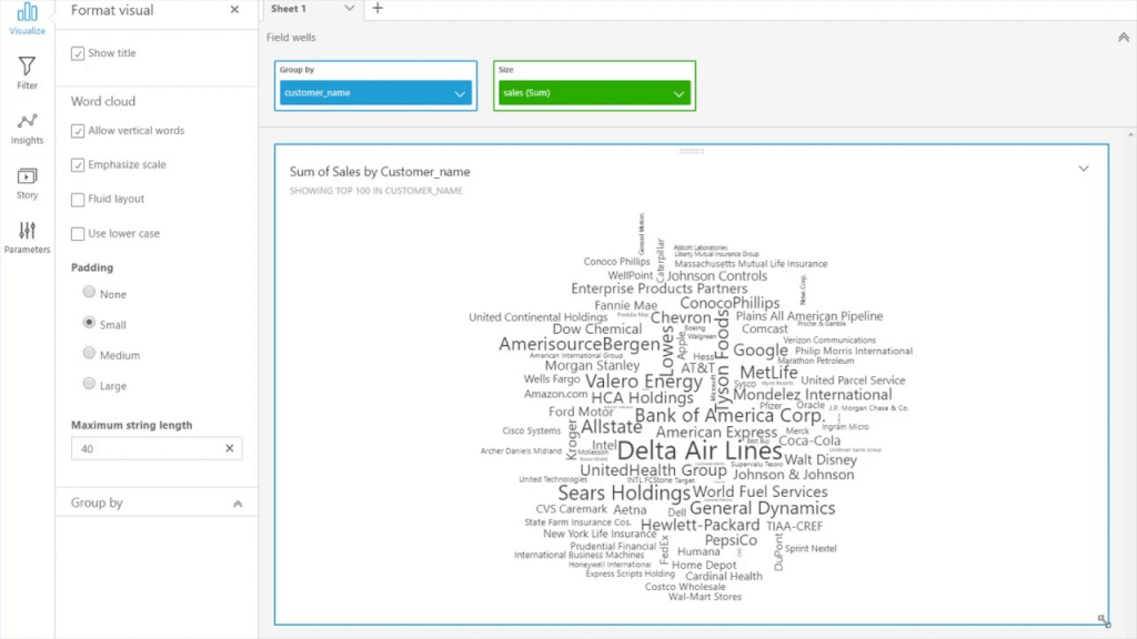
- Word Clouds: word or phrase frequency
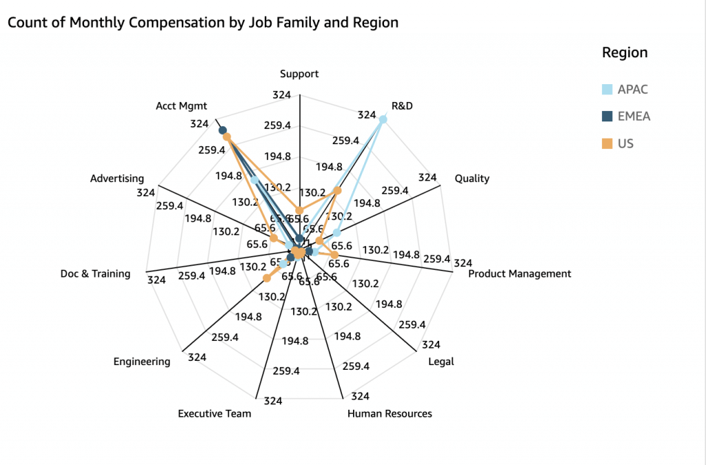
- Radar Chart
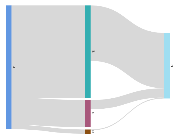
- Sankey diagrams: show flows from one category to another, or paths from one stage to the next
- Waterfall chart: visualize a sequential summation as values are added or subtracted
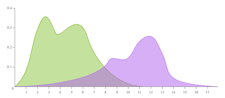
- (not provided) Density Plot
- aka Kernel Density Plot or Density Trace Graph
- visualises the distribution of data over a continuous interval or time period. This chart is a variation of a Histogram that uses kernel smoothing to plot values, allowing for smoother distributions by smoothing out the noise. The peaks of a Density Plot help display where values are concentrated over the interval.
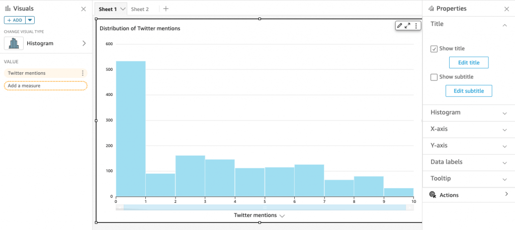
| Bar graph | Histogram |
| The bar graph is the graphical representation of categorical data. | A histogram is the graphical representation of quantitative data. (axis-x presents the data as either numeric or ordinal) |
| There is equal space between each pair of consecutive bars. | There is no space between the consecutive bars. |
| The height of the bars shows the frequency, and the width of the bars are same. | The area of rectangular bars shows the frequency of the data and the width of the bars need not to be same. |
 |  |
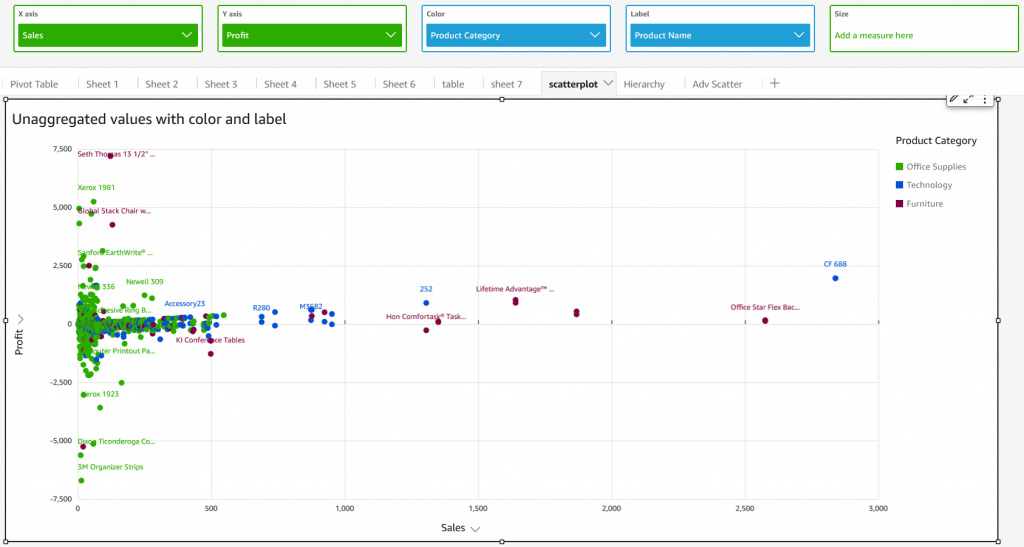
- [ 🧐QUESTION🧐 ] visualize recommendation results across four distinct dimensions
- visualize all four dimensions effectively:
- – X-axis: user’s interest score
- – Y-axis: product’s prior conversion rate
- – Color: product category
- – Size: number of impressions
- Scatter plots are ideal for this kind of multi-dimensional analysis, and SageMaker Canvas supports mapping both color and size attributes to data points.
- visualize all four dimensions effectively:
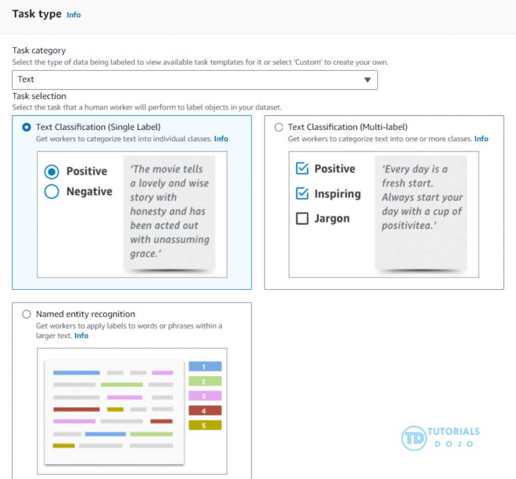
SageMaker Ground Truth
- Ground Truth manages humans who will label your data for training purposes
- Ground Truth creates its own model as images are labeled by people
- As this model learns, only images the model isn’t sure about are sent to human labelers
- This can reduce the cost of labeling jobs by 70%
- offers a unique combination of automated data labeling and human labeling to ensure efficiency and accuracy.
- By using active learning, Ground Truth can reduce the manual labeling required by automatically labeling data when it has high confidence in the predictions.
- seamlessly integrates with Amazon S3
- handling various data types, such as text, videos, images, and 3D point clouds
- provides built-in support for labeling tasks like text classification, object detection, and semantic segmentation
- incorporating feedback from human labelers, ensuring the accuracy of automated labels
- Ground Truth Plus is a Turnkey solution
- track progress via the Ground Truth Plus Project Portal
- Get labeled data from S3 when done
- Other ways to generate training labels
- Rekognition
- AWS service for image recognition
- Automatically classify images
- Comprehend
- AWS service for text analysis and topic modeling
- Automatically classify text by topics, sentiment
- Rekognition
Amazon Mechanical Turk
- a crowdsourcing marketplace that makes it easier for individuals and businesses to outsource their processes and jobs to a distributed workforce who can perform these tasks virtually.
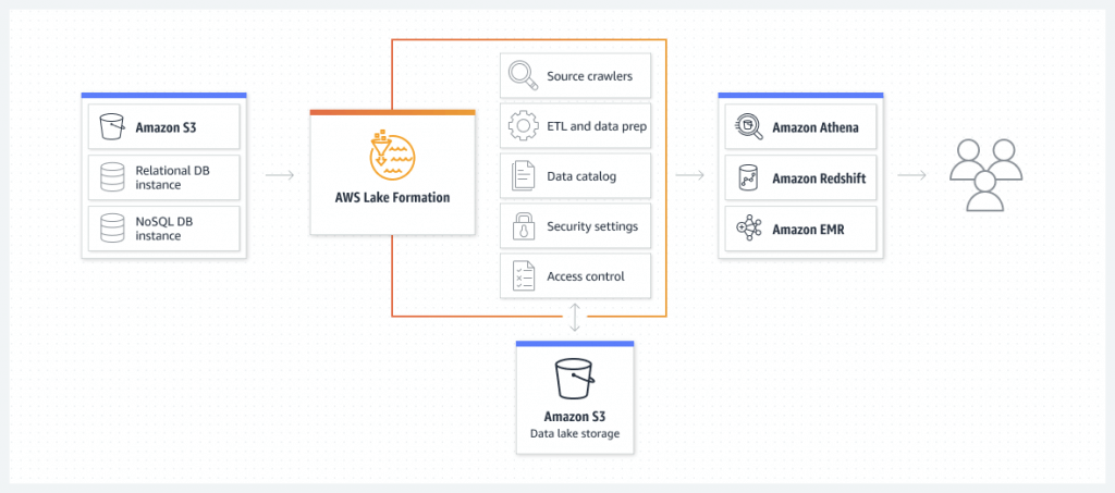
AWS Lake Formation
- Centrally govern, secure, and share data for analytics and machine learning
Data Analysis on Features Relationships
- correlation matrix
- Spearman’s correlation
- is particularly useful when analyzing relationships between numeric features where the relationship might not be linear or when the data does not meet the assumptions of normality
- suitable for both continuous and ordinal data, which is ideal for datasets that include a mix of numeric and categorical features
- Cramér’s V
- only ideal for measuring the association between two categorical variables and is not applicable for evaluating relationships between numeric features.
- Kendall’s Tau
- it is also a non-parametric correlation metric like Spearman, it is generally used to measure the ordinal association between two variables.
- Kendall’s Tau is often preferred when dealing with small sample sizes and ordinal data.
- Pearson
- correlation coefficient only measures the strength and direction of a linear relationship between two numeric variables.
- Pearson’s correlation assumes normality and linearity, making it unsuitable for analyzing categorical features or non-linear relationships.
- A correlation coefficient tells you how strong, or how weak, the relationship is between two sets of data. In Mathematics, a coefficient is usually the number that is used to multiply a variable. So for this expression: 9x, the number 9 is the coefficient. A correlation between two variables or data sets indicates that as one variable changes in value, the other variable tends to change in a specific direction. It is also called the cross-correlation coefficient, Pearson correlation coefficient (PCC), or the Pearson product-moment correlation coefficient (PPMCC).
Understanding this relationship is useful because the value of one variable allows us to predict the value of the other variable. For example, height and weight are correlated when it comes to your physique — as height increases, the weight tends to increase too. If we observe an individual who is unusually tall, we can also conclude that his weight is also above the average.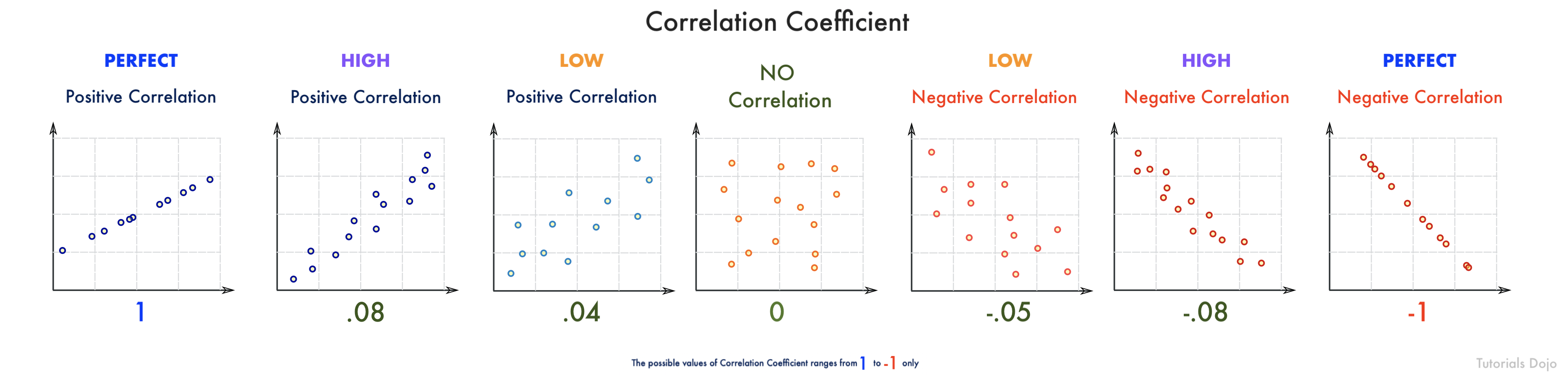
Pearson correlation coefficient measures the linear correlation between the two columns. The result is in the range [-1, 1], where 1 means positive linear correlation, -1 means negative linear correlation, and 0 means no correlation.
For the scenario, a correlation coefficient of -0.68 would look something like the picture above. As you can see, the data points are moderately scattered and pointing downwards. This means that social media has a moderate negative effect on the student’s academic performance.
Remember that a correlation coefficient with a negative value, like in this scenario (-0.68), means that the two data sets have an inverse relationship. So if the time spent on social media increases in value, the academic performance decreases. Conversely, if the correlation coefficient has a positive value (e.g. 0.68), then the increase of the value of one subset also causes the other subset to increase.